The KJV Sovereign Collection Personal Size Bible was recently released and here is my review of it.
The Good.
The Size is nice. It is your standard Personal Sized Bible that is slightly thicker but I like Bibles with some heft to them. It is easy to carry around and not very heavy at all.
The Font is great! It is dark and looks semi-bold. It is looks like a 9.6 size font and is easy to read. The drop caps add a bit of “old world” feel that I like. It is not too over bearing and the red accent on the headers and the verse numbers are nice. It also Psalms/Proverbs in single column format.
The Pages are nice. Not too thin and the line matching is perfect! I can easily turn them and take to a pencil well. There will be bleed through if you used most pens but the archival will work. I am not 100% considering I use pencils in my Bibles.
It is Smyth-Sewn and lays flat out of the box.
The Extras are helpful. It has the Miracles of Jesus Christ, The Parables of Jesus Christ, a One Year Reading Plan, and a Concordance. The Miracles and Parables list is very well done and easy to follow and so is the One Year Reading Plan. The Concordance is of course not exhaustive but it does have plenty of entries to get a student started.
The References are just your standard Thomas Nelson references and as I said on the Concordance they help any eager student of the Word have a starting point. I don’t agree with all there notes but are easy to ignore if one desires to.
The Headings/ Paragraphs seem well done and are pretty neutral Theologically. They keep to just describe what that set of passages are stating. It does indicate the traditional paragraph breaks by Bolding the verse number. I wish they had added the paragraph mark but it is good they still indicate it and are easy to identify.
The Book Summaries seem to be on the Conservative Christian side. (This is refreshing considering the Cambridge notes are more liberal with listing 2 Peter as not being by Peter!)
The Bad.
The Red Lettering is… well… not the best I have seen. Some of it reminds of “Atomic Pink”. There is some variation as I can see that it was suppose to be a little dark but seems to not be as consistent as I would prefer. ( I am a Black Letter Text kind of guy so Red Letter is not preferred. But, I don’t hate it). I can still read it pretty well so it is just a minor complaint.
The Summary of my Review
My thoughts on the KJV Sovereign Collection Bible is very positive. It is easy to read in lower light due to the Semi-Bold font. The Drop Caps add a certain “old world” feel and I like that! The red accents for the verses, chapters and headers are very well done. The Red Lettering for Christ’s words could have been done better at the printer but I really like the Bible. Not my first choice but I recommend to anyone who is looking for a new Bible under $50.
A. T. Sully
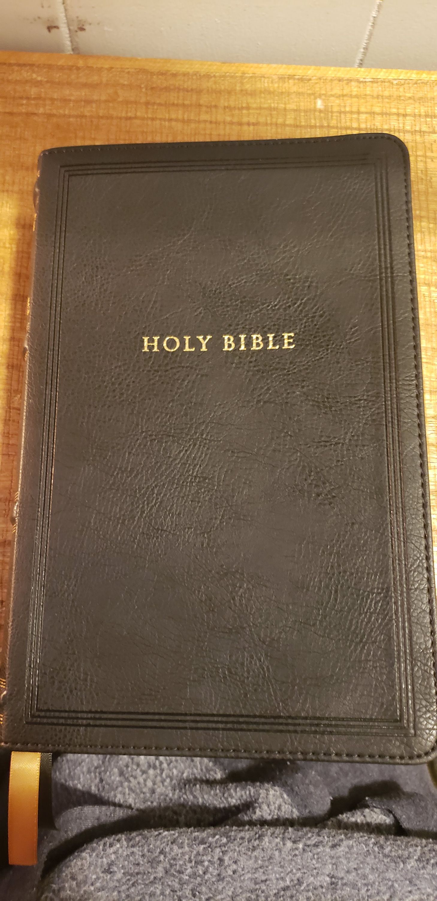 Photo of KJV Sovereign 1.jpg
 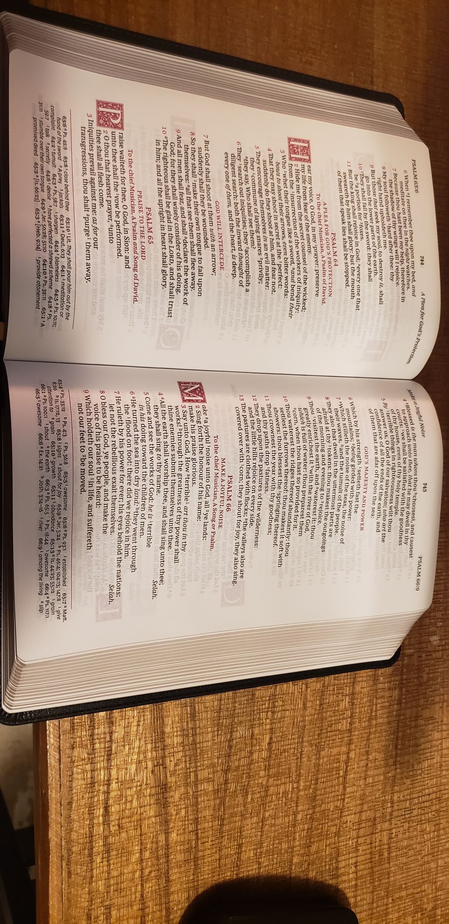 Photo of KJV Sovereign 2.jpg
 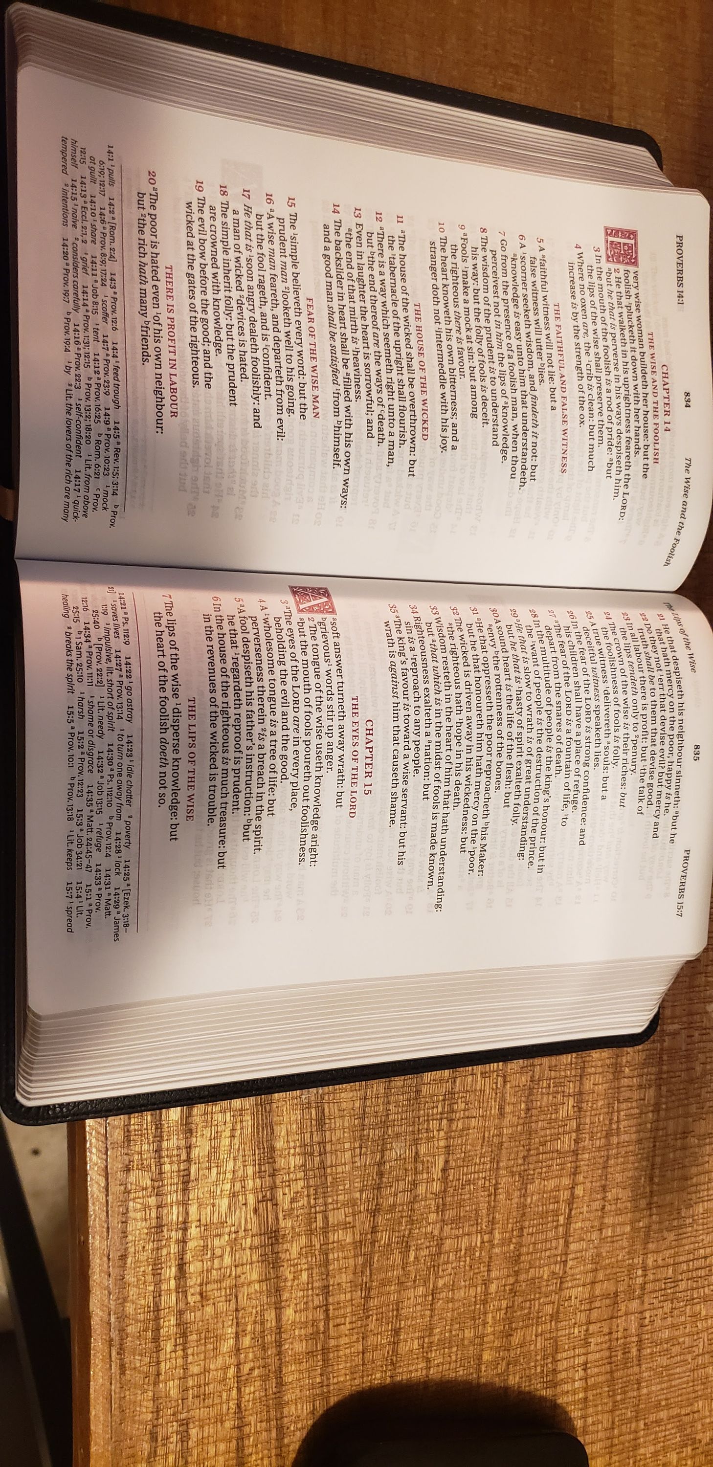 Photo of KJV Sovereign 3.jpg
 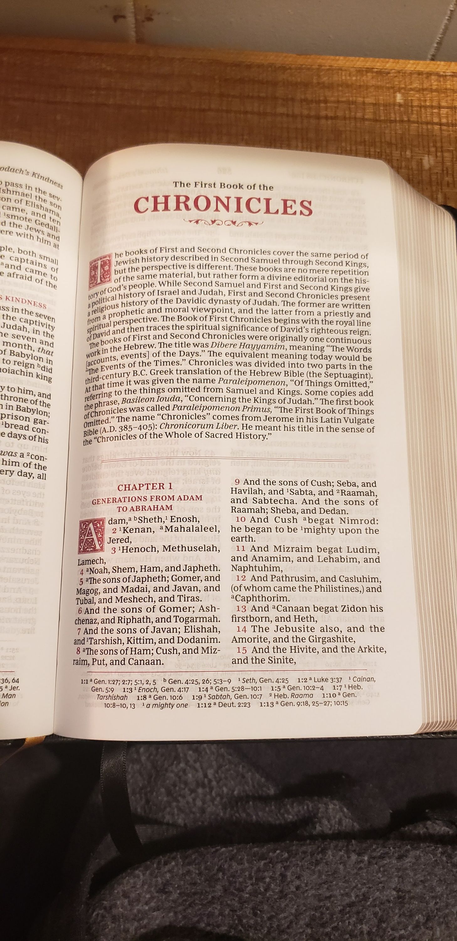 Photo of KJV Sovereign 4.jpg
 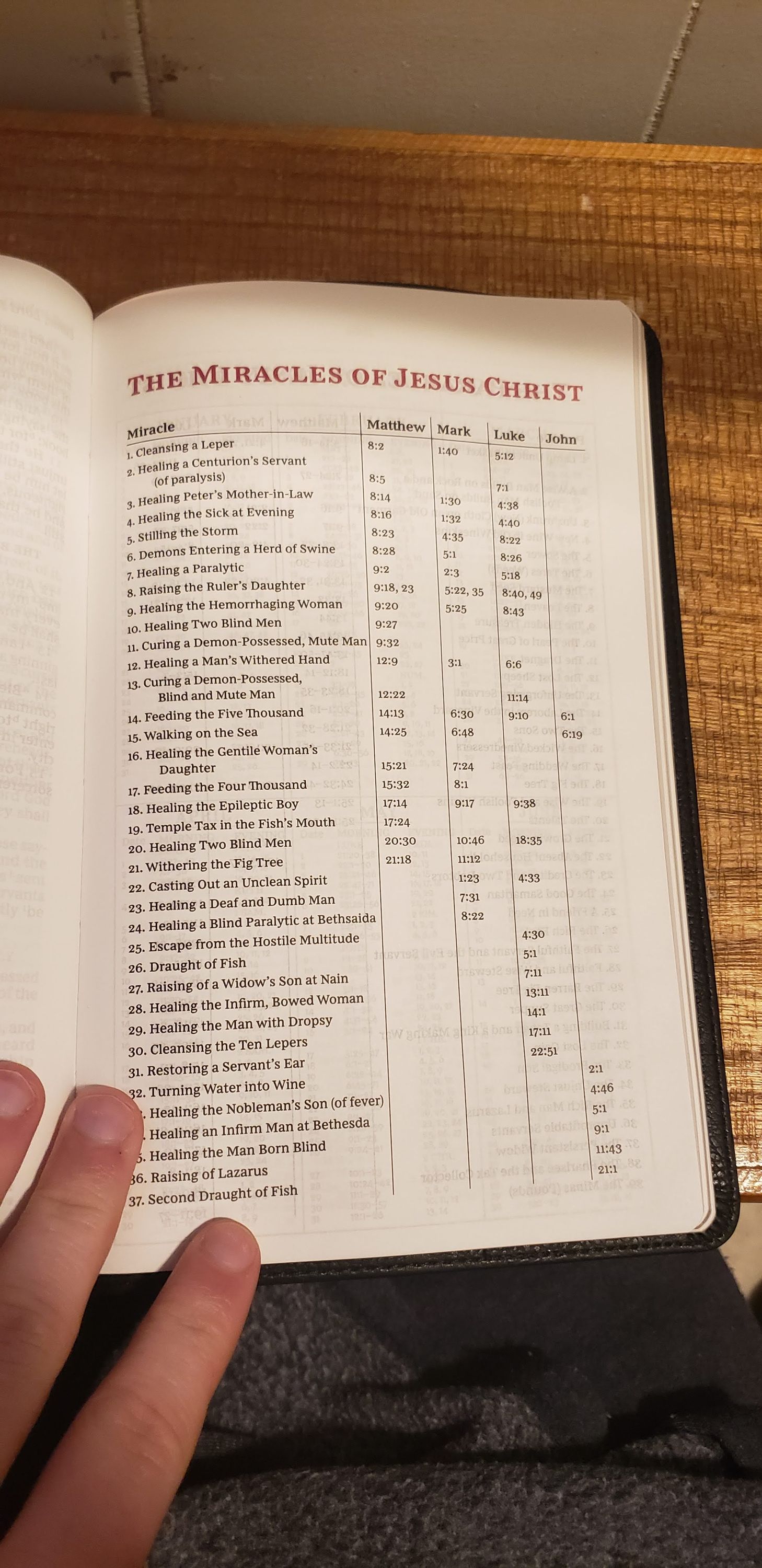 Photo of KJV Sovereign 5.jpg
 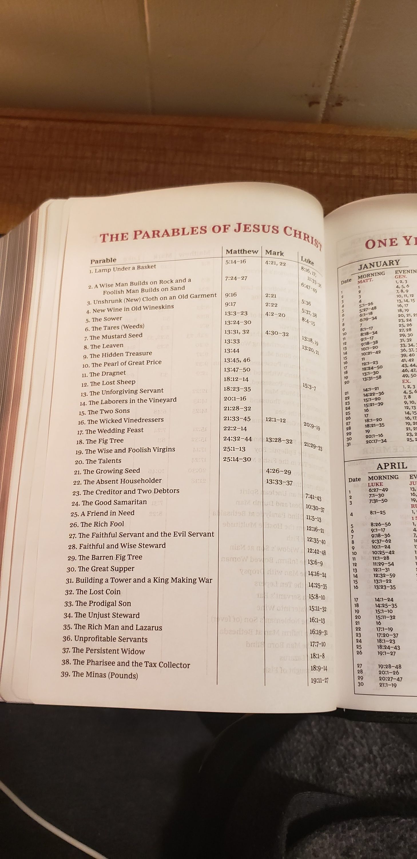 Photo of KJV Sovereign 6.jpg
 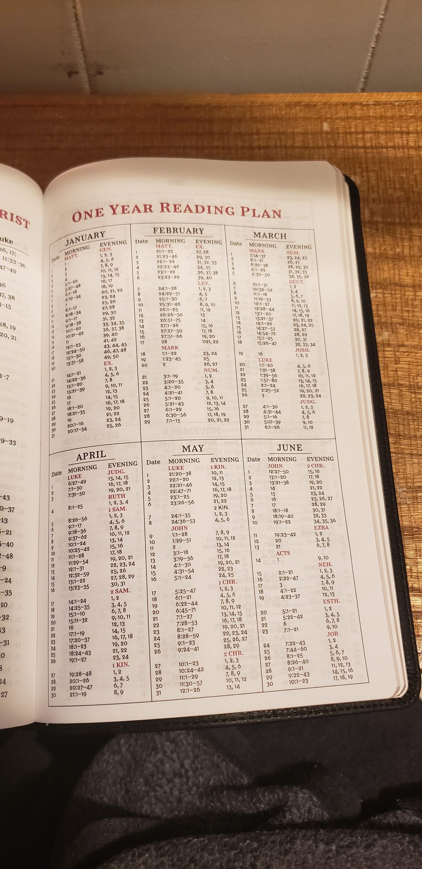 Photo of KJV Sovereign 7.jpg
 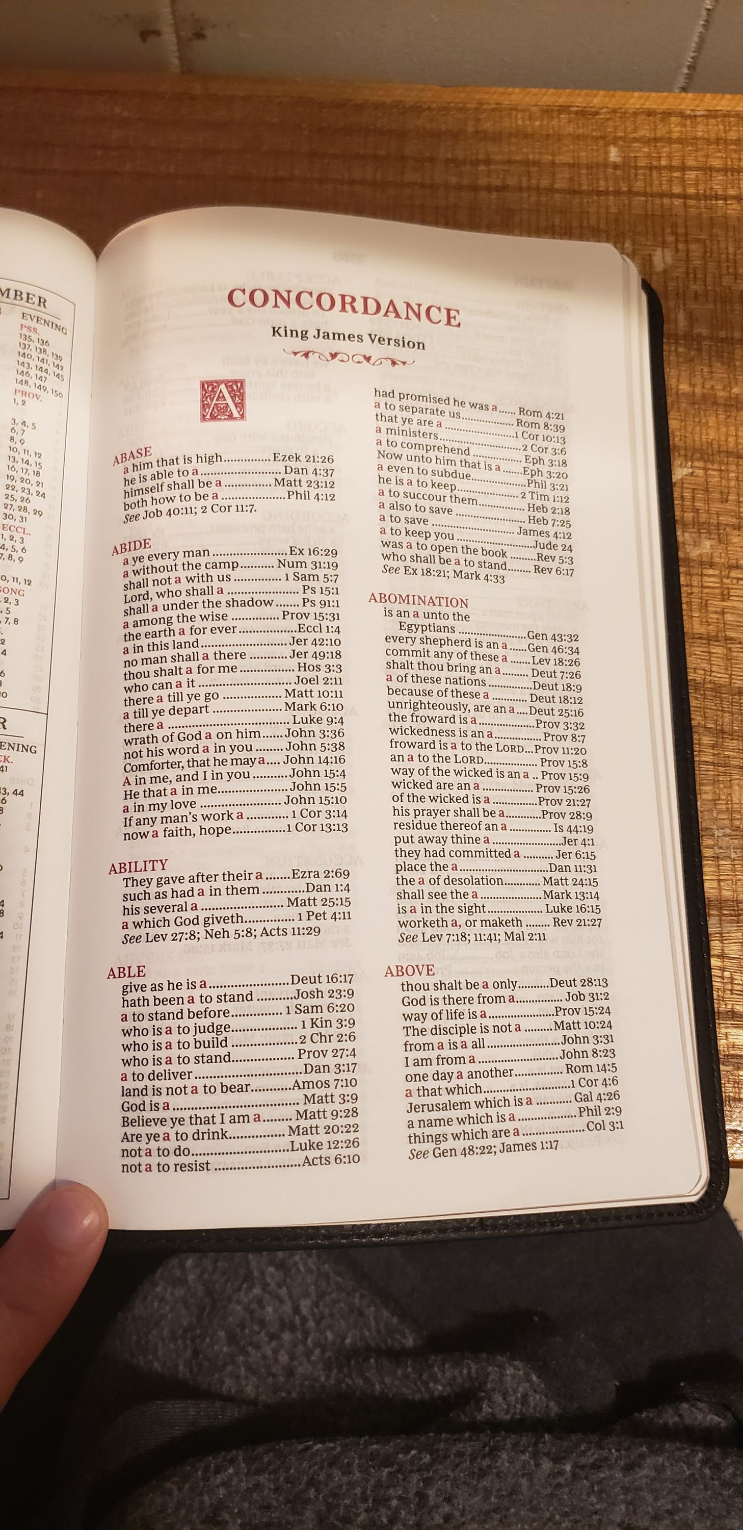 Photo of KJV Sovereign 8.jpg
 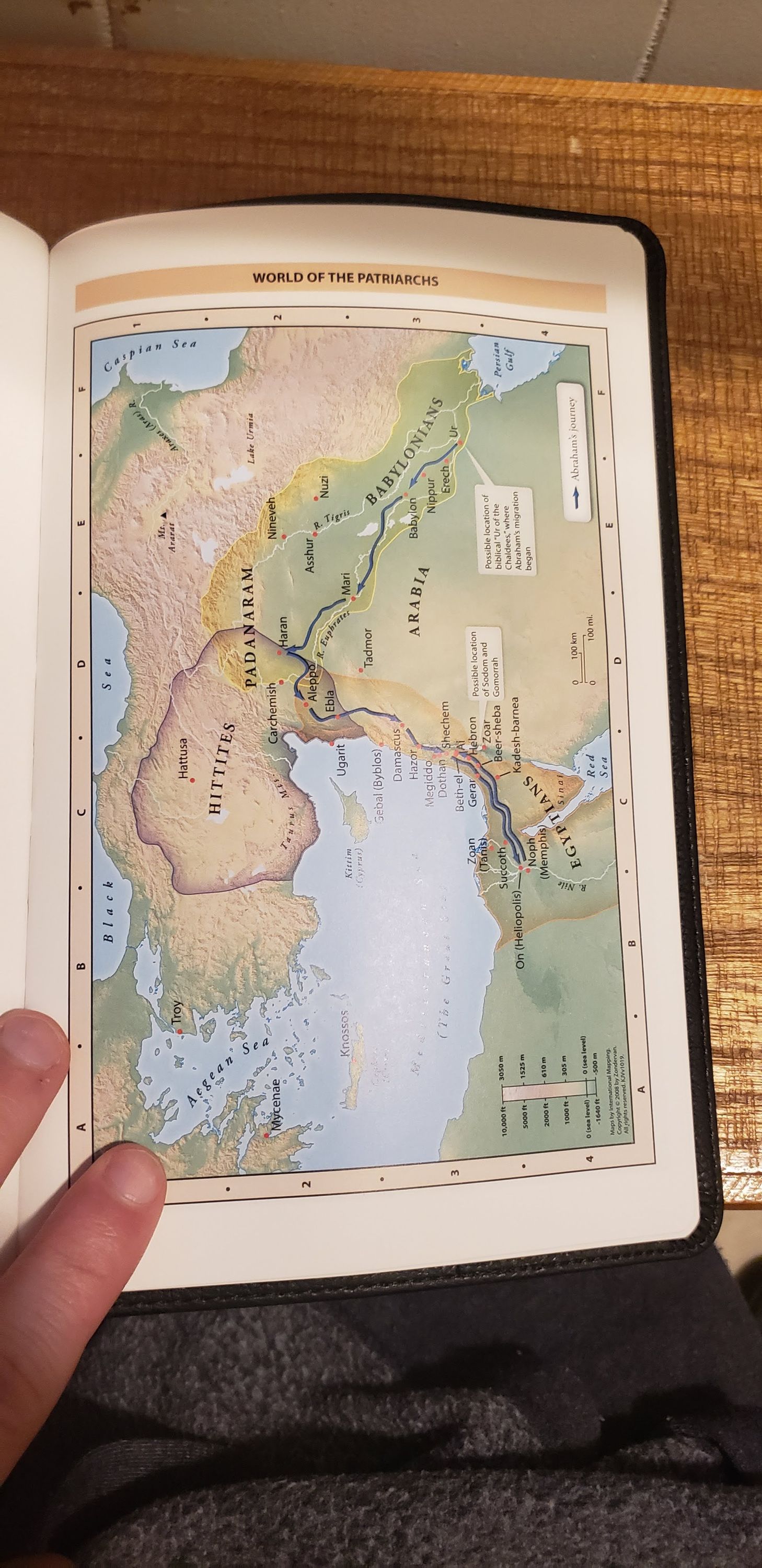 Photo of KJV Sovereign 9.jpg
 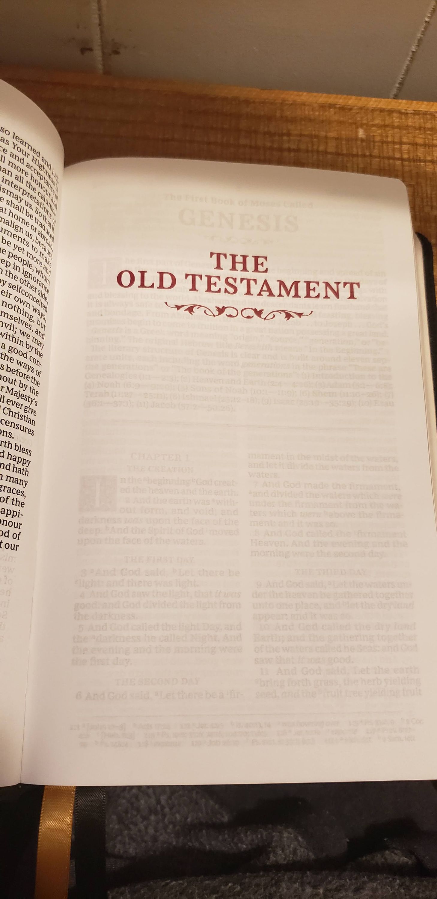 Photo of KJV Sovereign 10.jpg
 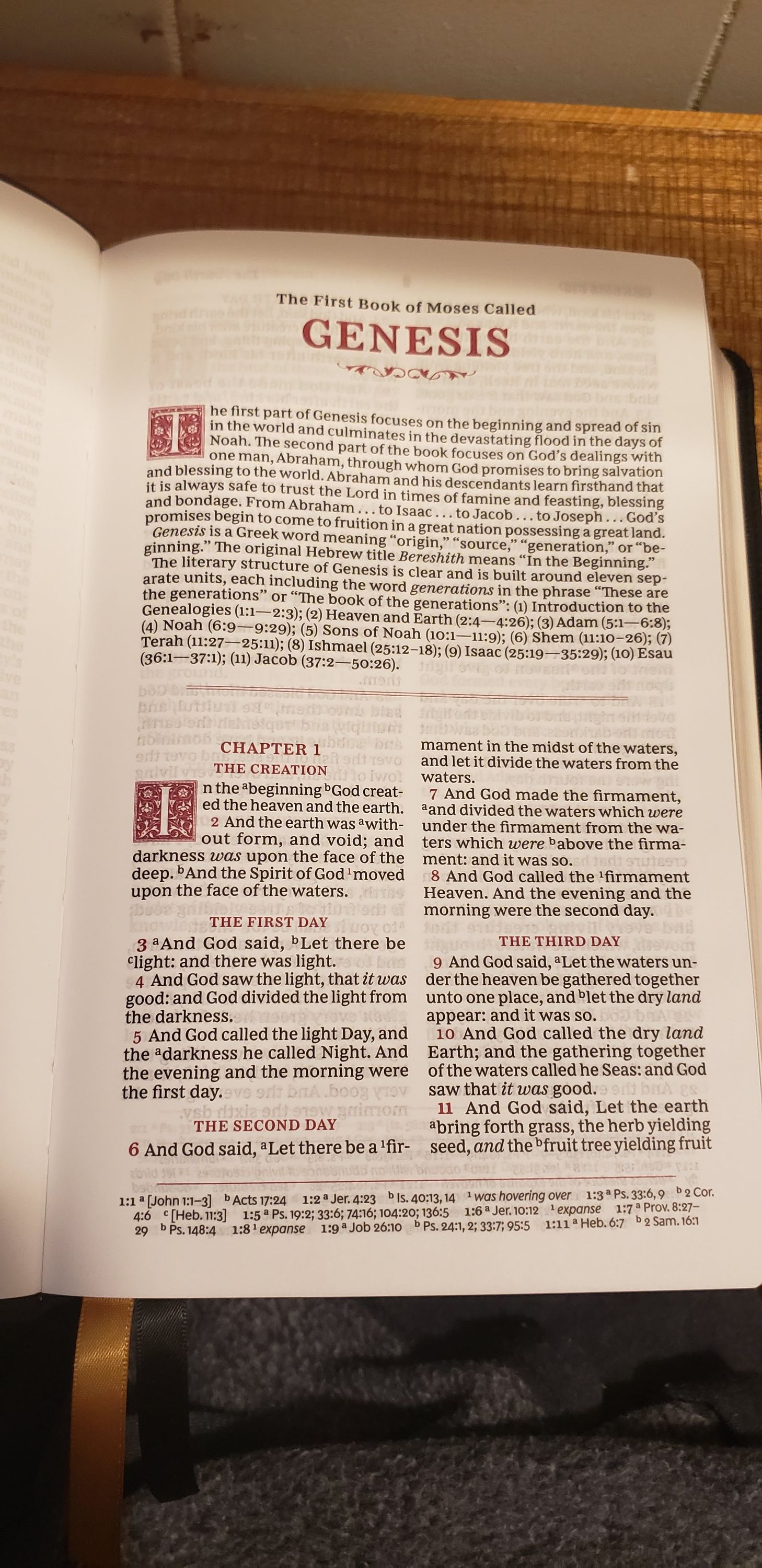 Photo of KJV Sovereign 11.jpg
 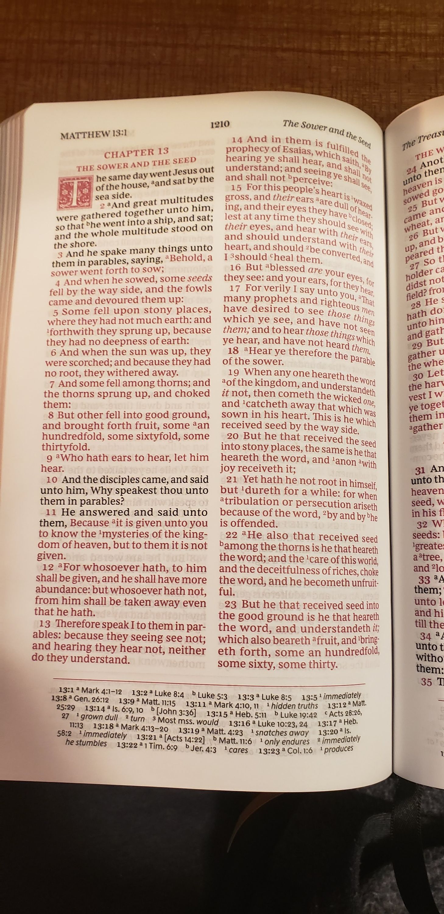 Photo of KJV Sovereign 12.jpg
 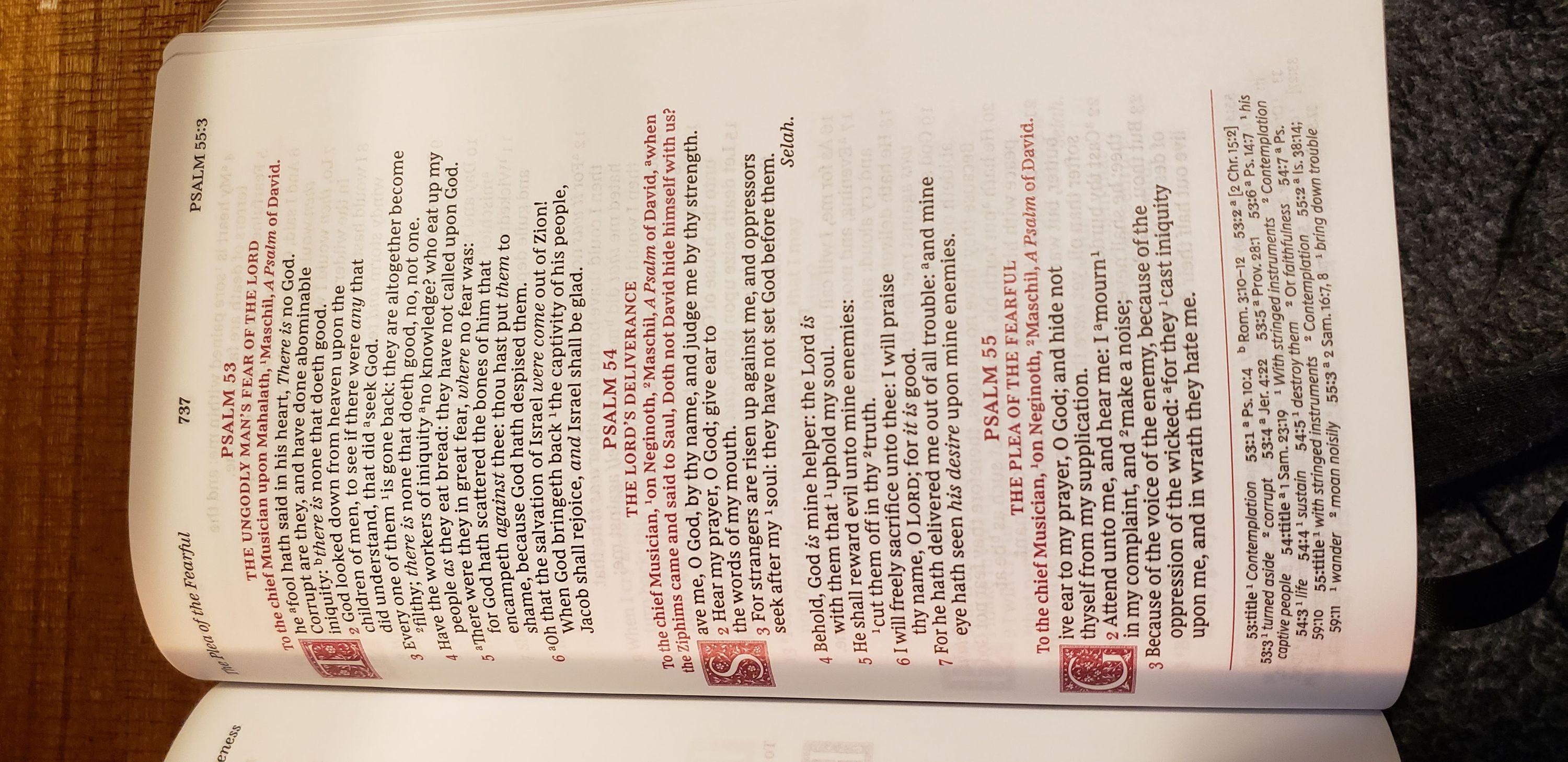 Photo of KJV Sovereign 14.jpg
 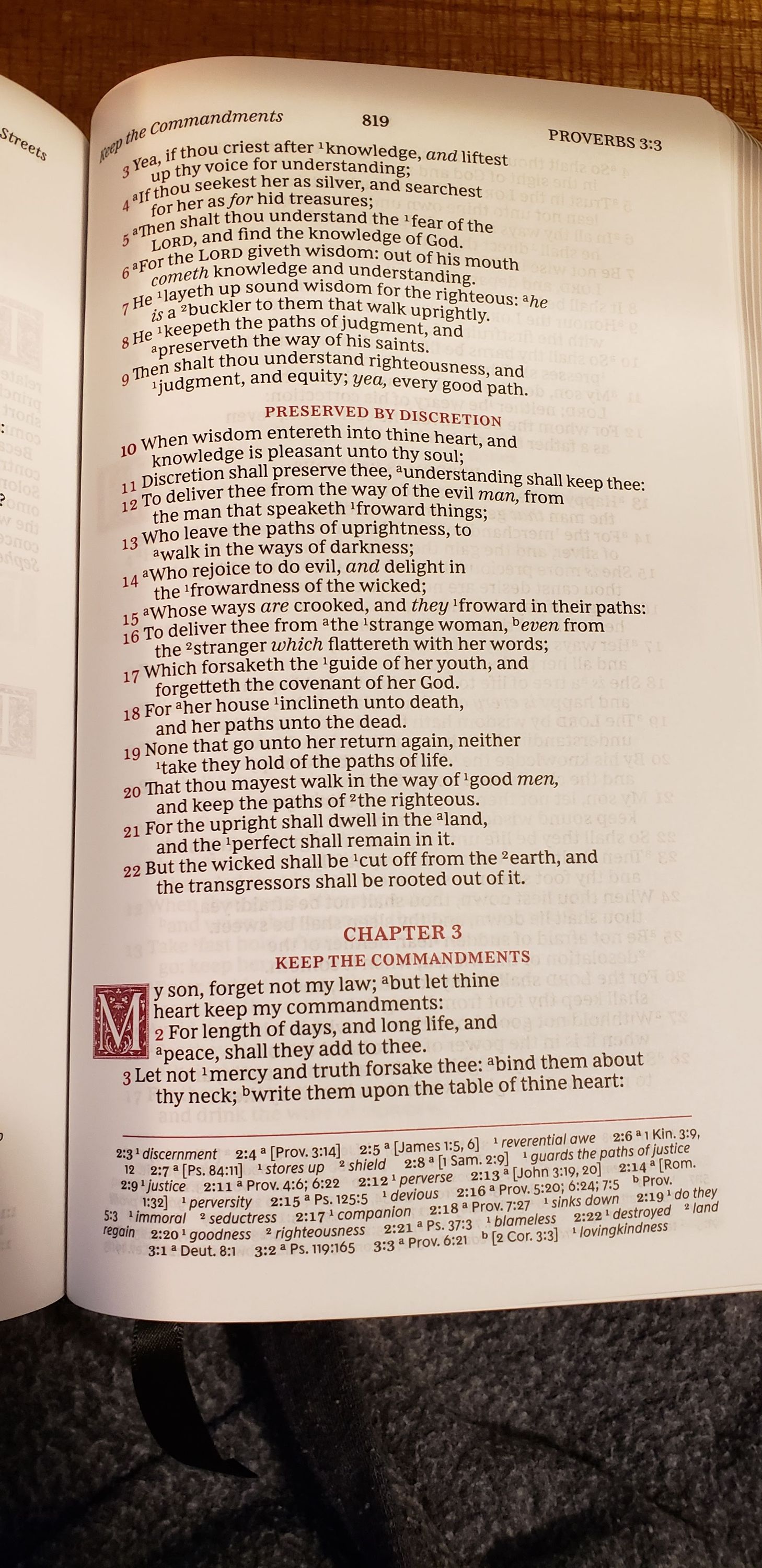 Photo of KJV Sovereign 15.jpg
 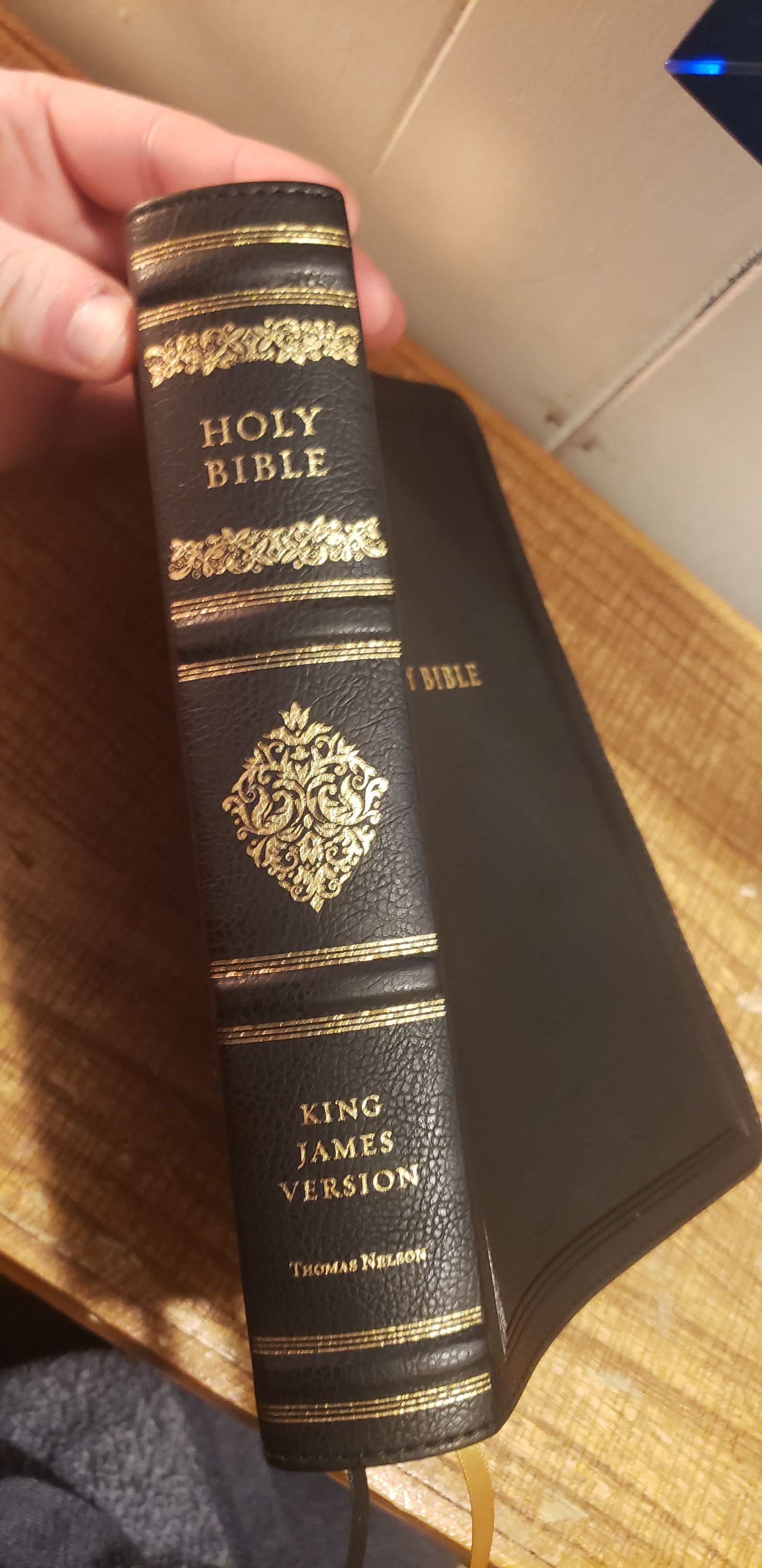 Photo of KJV Sovereign 13.jpg
― ♰ ―